Brand + Website: Renovation Spot
I’ve been on retainer for the Renovation Spot since 2016. Its been incredible to watch the growth of this local home renovation and builder in the years since then. Amanda and Shahab are real estate powerhouses and in 2016 they finally took their expertise into renovations and then eventually home building.
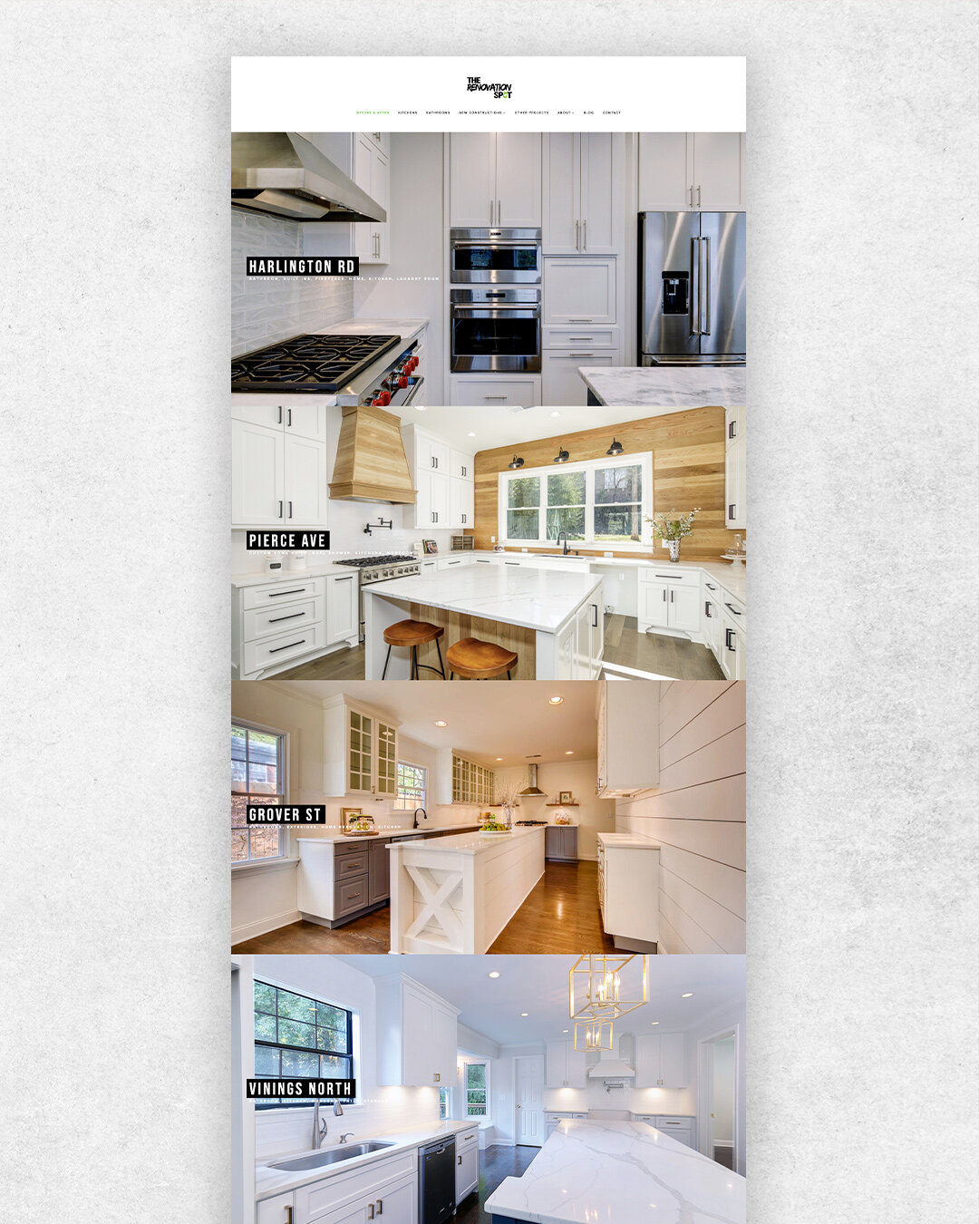
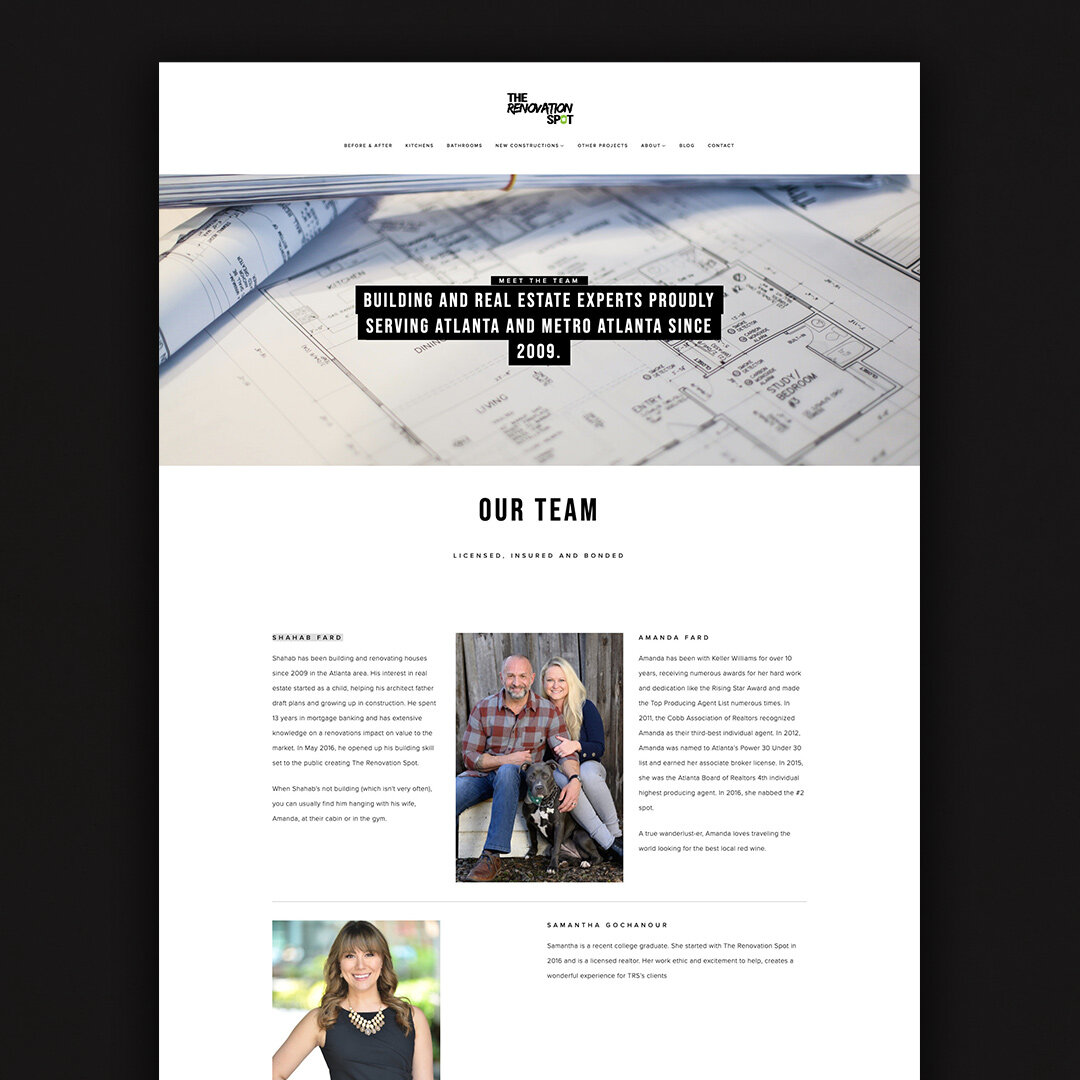
Their website is hosted on Squarespace. It was the perfect platform to give the clean design and aesthetic The Renovation Spot is known for. The imagery of their projects go full bleed to each edge of the screen so the user can take in and appreciate the quality of their work.
The Fard’s are the best clients for a lot of reasons but one reason I love them is they trust people to do their jobs and let them run with it. Having full control of their social media and online presence, I utilized Pinterest as the social media platform to focus our efforts. We pushed content to all the other platforms as well, but given that Pinterest is so popular with home building, I knew it would succeed. And it did. They grew to have a following of 5K users and averaged half a million to 800,000 impressions a month on Pinterest.
I also maintained their Houzz profile, which was the first time i had done that and learned a lot. In our first year we gained over 1K saves on one image and earned Best of Houzz for two years in a row.
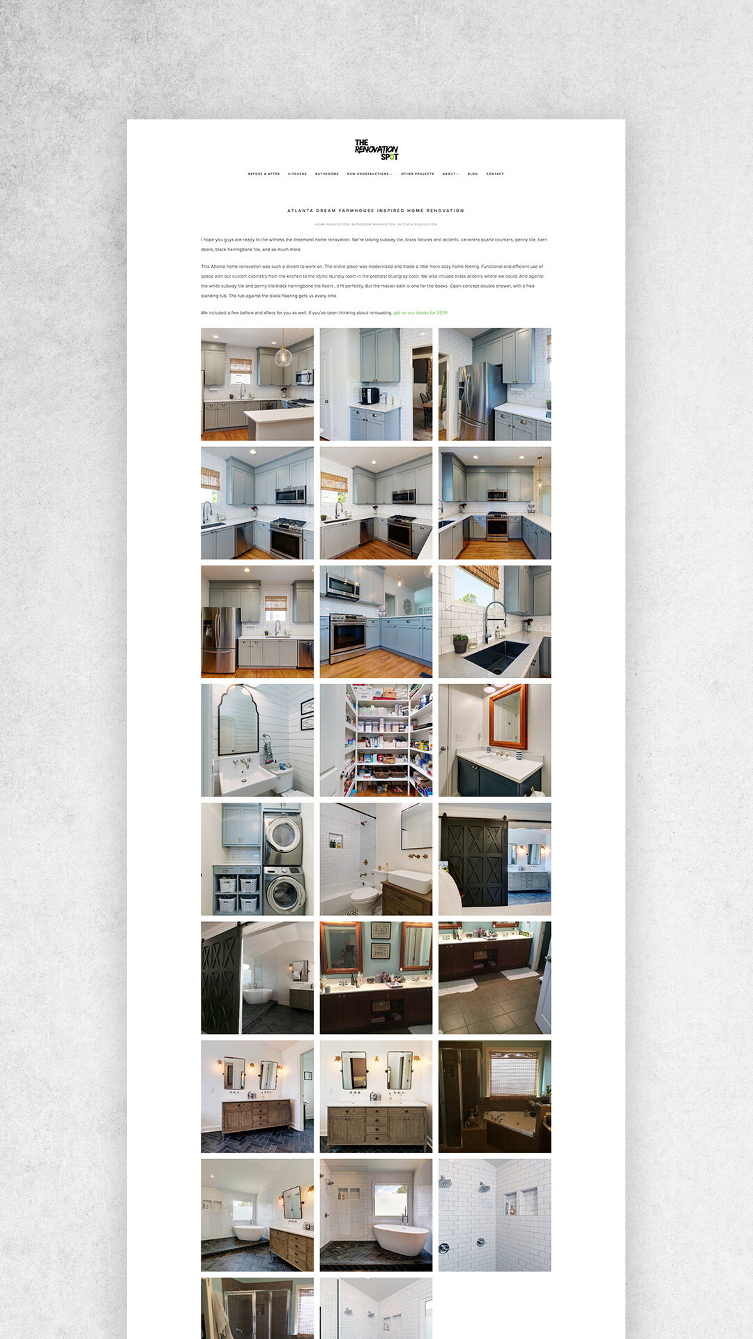
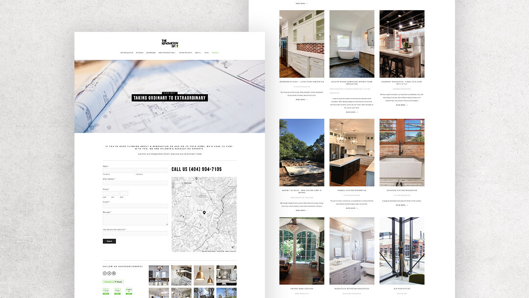
I felt it critical for their site, well any site really, to have the same size thumbnails and imagery. Nothing makes a site seem a bit outdated and DIY then having images the wrong orientation next to each other and nothing lining up. So for their blog posts and galleries, every photo was cropped to be the same orientation giving each project the same polished look.
You can view the site yourself here and if you need any renovation work done in the metro Atlanta area, give them a call!


